Gemeinde Wackersdorf
Cultural Weeks in Wackersdorf
the challenge
our approach
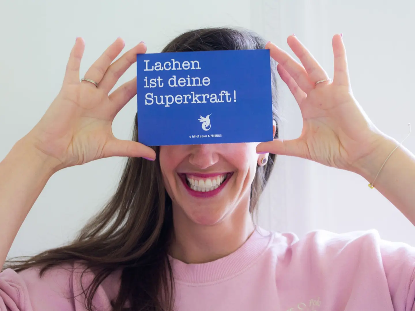
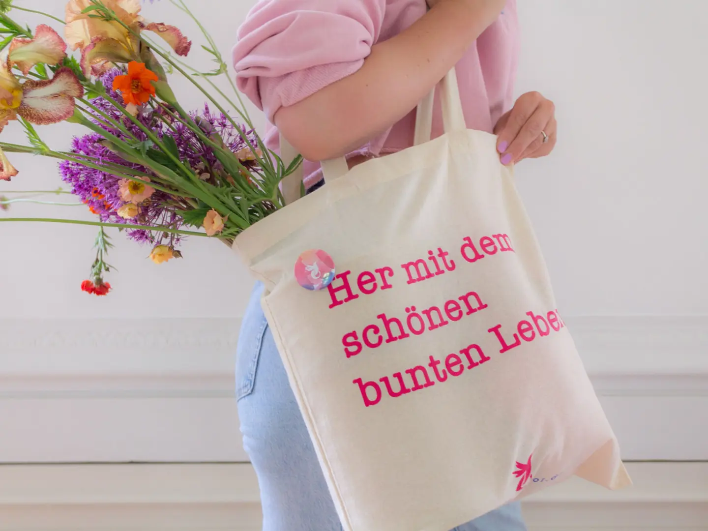
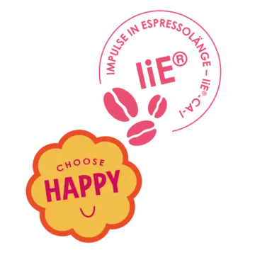
The concept, based on living a colorful, true and happy life with the positive energy of a good network and cooperation, was the perfect trigger for designing a visual world where imagination has no limits.
Keywords like colorful, your best self, life coach, fun, lightness, focus, love and joy, are essential to Veronika’s work. She, and her team, pay attention to every detail and you experience this since you make your first contact to when you visit the “Zentrum für Lebensfreude”. A magical space, located in a fresh, green area, in Regensburg.
our solution
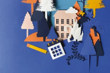
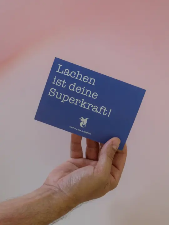
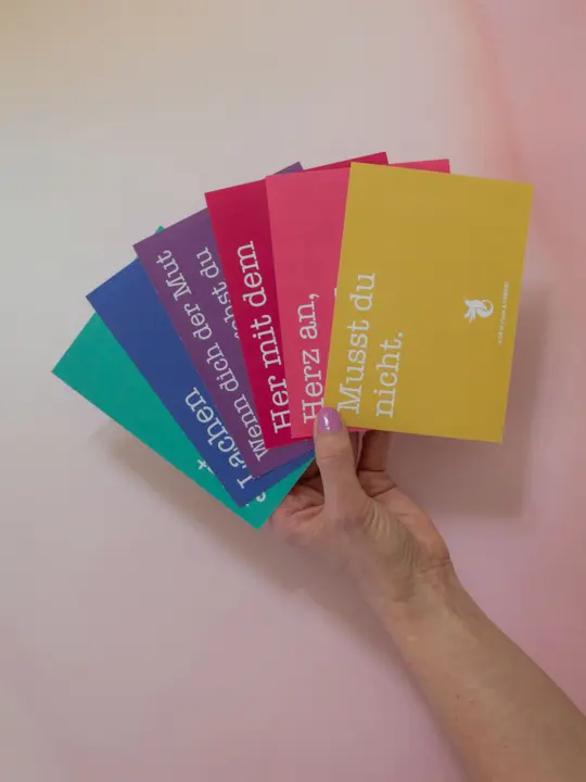
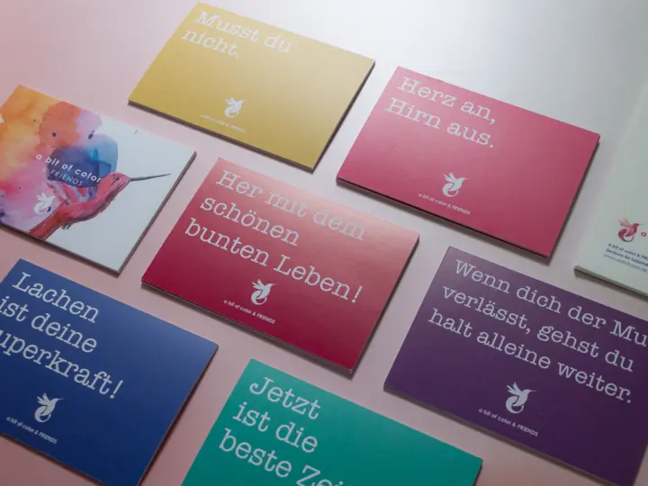
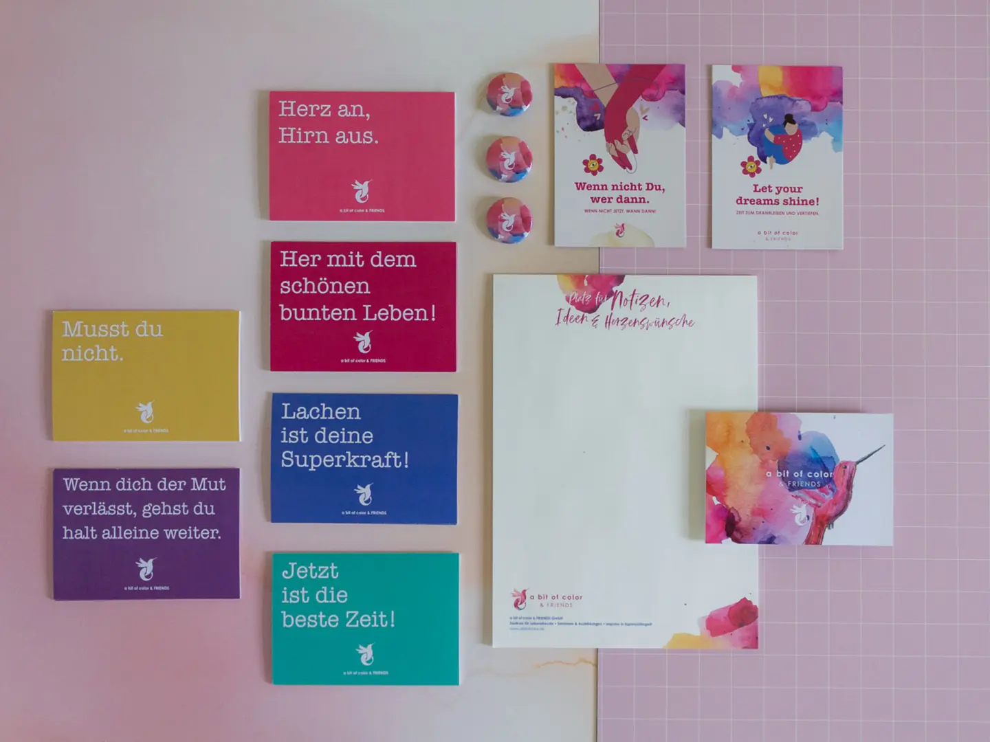
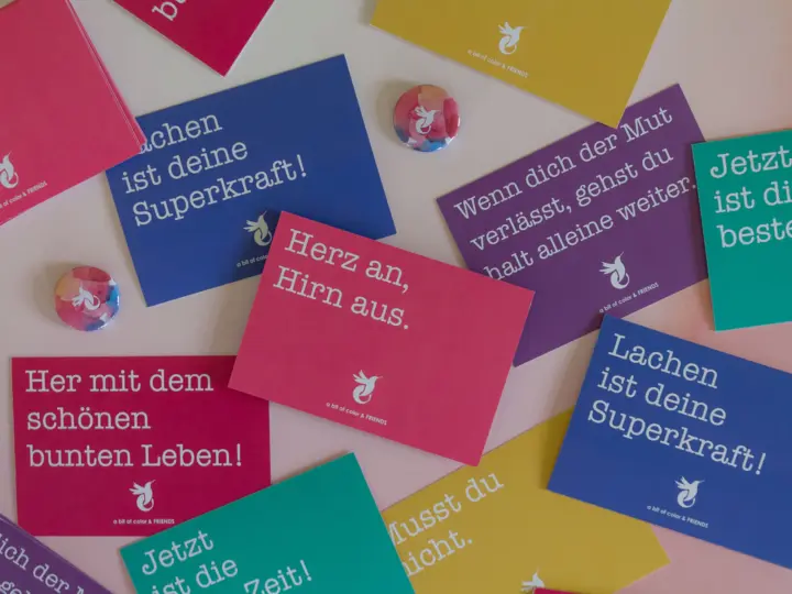
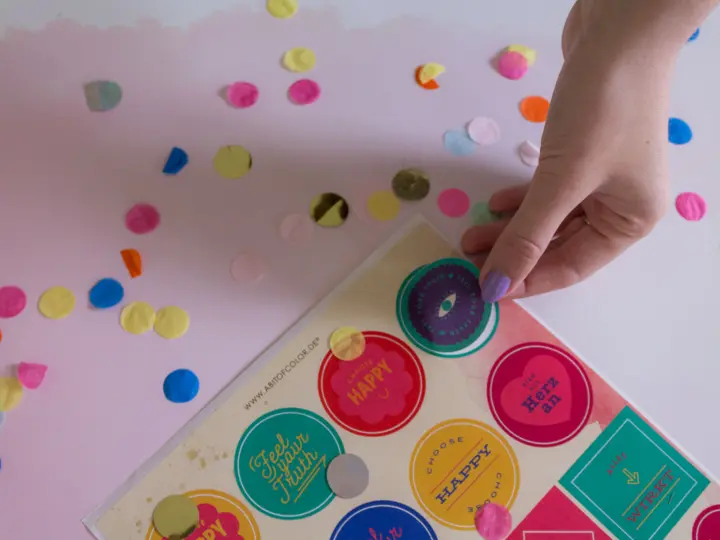
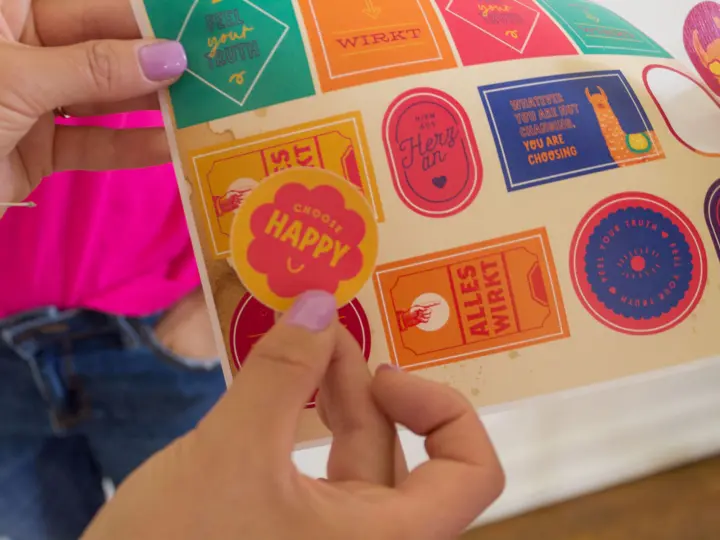
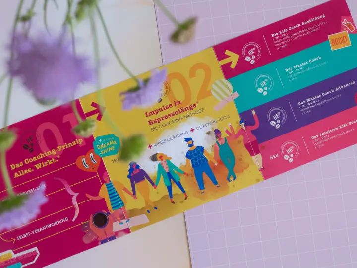
For this joyful way of making business and facing life, we created a vivid and dynamic graphic world with two faces.
It’s a visual world combining strong color block layouts with a more subtle, dreamy style. The first conveys energizing quotes, the second reveals details in a playful, inviting way.
The result, an identity as colorful and positive as Veronika and her team! Open to new challenges, intuitive and customizable by members of the team themselves.
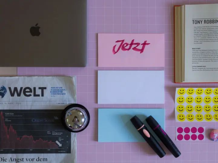
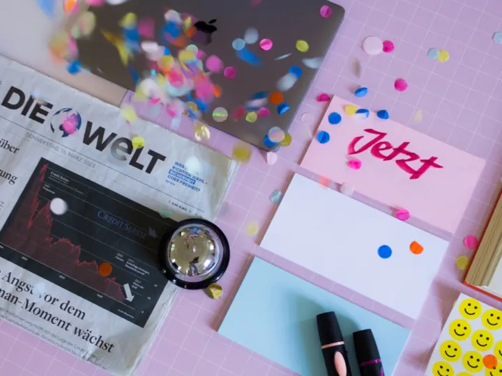

In a crowded marketplace, unique and professionally produced visual content can help your business stand out. Brand shootings give you the chance to highlight the distinctive features and benefits of your brand’s products or services, by creating unique visual content that mirrors your brand identity.
And don’t forget about Storytelling! This aspect can create emotional connections with your consumers and foster brand loyalty.